Recent years have seen a tendency for world-famous luxury fashion brands to exchange their well-known logos with their distinctive lettering for a clean, simpler design. Interestingly, though, not only has fashion brands’ choice fallen on a similarly simple font, it has in fact fallen on exactly the same sans serif font. When one of the essential functions of a logo is to set a brand apart from its rivals, what benefit can a brand derive from looking to blend its logo in with those of its fellow market brands. Could this be just a question of image or is there perhaps a legal consideration behind this choice of uniform design?
When it comes to giant fashion houses like Chanel, Gucci, Givenchy or Balenciaga, the brand name fulfils more than just an essential trademark function like product indication. A product bearing the brand name also serves today as a status symbol for the person wearing or carrying it. For example, anyone who buys a Birkin bag will not only get an exceptionally high-quality bag, but is also seeking to be part of the exclusive world which Hermés represents, or at least that is the ethos of the marketing strategy behind most luxury brands.
The fact that consumers immediately recognise fashion brands’ emblematic logos and associate them with the high quality they represent is the result of substantial investment on the part of the brands. This also means that the name itself is an essential element of their image and it is therefore crucial for the success of the brand that this is protected effectively.
As a result, a number of fashion houses with portfolios extending to thousands of trademarks seek the widest scope of protection for their brand name and related elements.Intellectual property law offers a number of tools to protect their intellectual creations, among which trademark law is perhaps one of the most common. A trademark provides an exclusive right over a given designation, which may be, inter alia, a colour, a three-dimensional shape, a position, a sound, a pattern or even a designation which reflects movement. Today fashion houses seek trademark protection not only for the key elements of their image, such as their logo or name, but also for other signs that are integral to the brand. So, Burberry’s well-known checked pattern, the iconic blue of Tiffany’s luxury jewellery store and even the three-dimensional shape of the Dior J’adore perfume bottle are all trademark protected.
Traditional trademarks reimagined
A fashion brand’s image is built up on the basis of a number of factors, among which the brand name font is a cardinal point. A well-chosen brand name font can instil trust, quality and exclusivity in the consumer, while a less successful choice of font can easily have a detrimental effect on the brand itself, the message it wants to convey and even on its sales data.
It is perhaps no surprise then that when Burberry’s newly hired creative director, Ricardo Tisci, came up with a new logo and pattern for the traditional English fashion house of more than 150 years’ standing, it caused quite a stir in the fashion world. Well known to many since its establishment in 1856, the Burberry brand is now inseparable in many people’s minds from the emblematic trench coat, the checked pattern and the traditional, classic style the brand represents.
Famed for his minimalist taste, Tisci, previously creative director of Givenchy, chose not to preserve even the slightest feature of the Burberry equestrian logo, which has been under trademark protection since 1905, opting instead for a completely new design. The new logo is the result of the creative director’s collaboration with designer Peter Saville, the latter stating: „Me and Tisci settled on ‘modern utility’, it looks like it’s been there forever, but it’s still contemporary.”
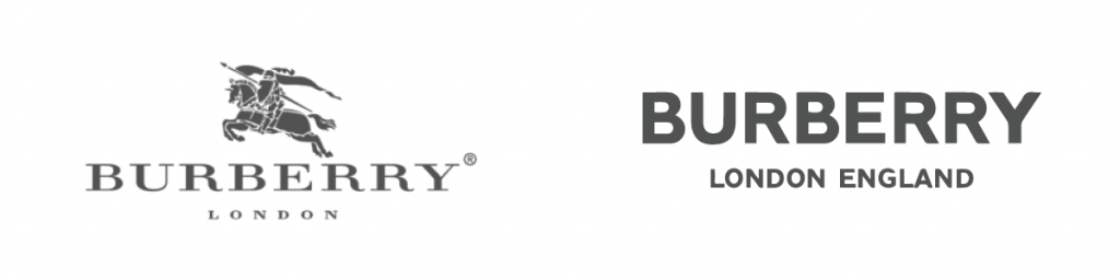
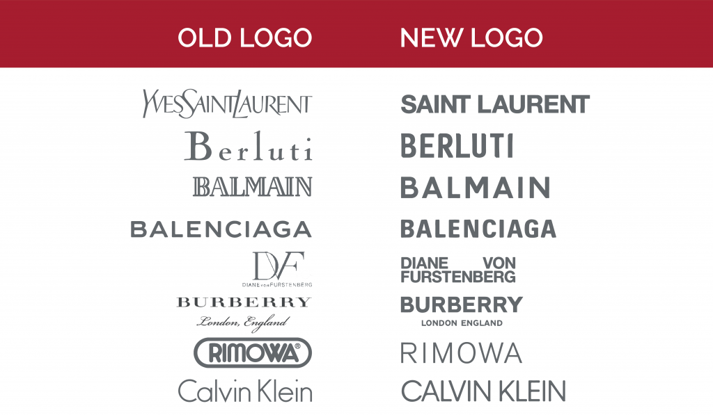
Burberry’s rebranding has received mixed reviews from the press. Brand New, for example, sharply criticised the new logo, saying that the long-standing, classic equestrian Burberry logo had been equally ordinary in its day as the new dry sans serif font designation is today. Moreover, the new Burberry logo is no different from the sans serif fonts of other major fashion brands or from Peter Saville’s previous creations, such as the redesigned Calvin Klein logo.
Burberry’s decision to embrace a distinctive minimalist image reflects that of many major fashion houses who have similarly opted for a significantly simpler, geometric design. One of the indisputable advantages of logos in bold, clean letters is that they can be adapted easily to different platforms. Luxury brands have also seen sales hit at brand stores on the most prestigious streets of major cities as their customers move towards buying their favourite pieces through online stores. After all, an online presence is now an essential requirement for all brands. In addition to having their own websites, brands are present on most social media platforms, where the new sans serif logos are significantly easier to use. They are much easier to resize to look good on giant posters, shopping bags, the products themselves and even on the brand’s Instagram site.
According to TFL though, there may be a much more tangible reason behind the new tendency. A significant number of fashion houses are now part of larger parent companies. LVMH (LVMH Moët Hennessy – Louis Vuitton SE) is perhaps one of the largest companies, bringing together more than 75 brands, including Fendi, Loewe, Rimowa, Berluti, Celine, Givenchy, Dior, Marc Jacobs, Bvlgari and the list is constantly growing. One of the main goals of listed parent companies is to minimise potential risk. As a result, products are all manufactured, from selecting fabrics through to branding, based on preliminary trend forecasts and careful metrics. It is perhaps not surprising then that continuous brand unification has started down this track.
These fashion houses have major impact, as the trends they forecast are not only followed by brands such as the Inditex Group or H&M selling mass-produced fashion items, but other industries also follow suit with their designs. Simplified logos have not only appeared in the fashion world, but as Fast Company has pointed out, from 2018 onwards this tendency has also been visible in the IT sector.
Legal assessment of the tendency towards minimalist logos
The new trend is not for characteristic, chiselled, customised fonts that can stand out from other brands, but much rather for unified sans serif logos that can blend in with other brands. How this issue is assessed from a trademark law perspective varies depending whether the matter at hand is a giant fashion house changing its image or a fresh start-up choosing an appropriate logo.
When it comes to the fashion companies mentioned, the purpose of the simplified logo may even be to facilitate taking action against infringers. In the event of possible infringement the logos are compared in order to establish whether likelihood of confusion between the marks exists, i.e. whether infringement has in fact taken place. Consequently, a figurative mark incorporating a simple sans serif font may well enable a brand to be more successful against signs containing identical or similar elements. It should also be noted that these companies are exposed to infringers and counterfeiters to such an extent that the word elements of their figurative marks have also been protected as word trademarks for the reasons just described.
Pursuing this trend may not be the most fortunate choice for a new brand, however, as a figurative trademark must have a strong distinctive character in order for it to be successfully registered with a trademark office. Unlike for the world-famous fashion houses with their established, well-known names, it can be difficult for a brand which does not incorporate any figurative element or special font to meet this requirement. Choosing exciting, strong logos and names with characteristic fonts not only makes it easier for the logo to be registered as a trademark, but can also constitute the cornerstone of a successful business.
A figurative trademark comprising simpler letters or a word trademark may be the ace up your sleeve in combatting infringers seeking to register their trademark, but the word element itself must have strong distinctive character and meeting this criteria is obviously a far more straightforward matter for a globally recognised logo that has been around for a hundred years than it is for a fresh start-up.
In conclusion, for iconic brands with a long history, such as Burberry or Diane Von Furstenberg, a change of logo that is questionable from a design point of view raises fundamentally different issues from a legal standpoint. These brands have always been one step ahead of the game though. When Gabrielle Chanel first unveiled women’s trouser suits to ladies wearing corsets, it caused a huge outrage, while it is now an essential piece in almost every woman’s wardrobe.